Materials and Romano Hanni's "typo bilder buch"
It's not just the format and structure of Artists' Books that challenge author/artists, it is also the materials they use even in quasi-traditional formats such as the traditional book. One delightful and surprising example of this is
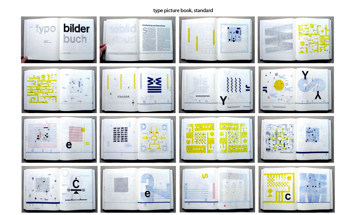
Romano Hanni's "typo bilder buch" (typo picture book) which, while appearing to be a hefty volume, is feather-like in weight. The reason for this is that the book is letterpress printed on a hand-proofing press on paper towels hand-sewn together. Bound in corrugated cardboard and using four colours this book is an explosion and exploration of shapes, colours, designs, and scripts. The author states, in a humorous extension of his reasoning
"Since the invention of script and the printed word, we have lost access to pictorial statements: we have become character devout. Nonetheless, we still read images. Fluent reading is based solely on prejudices. The knowledgeable rdeaer deos not pecie toghteer indaidviul chaearcrts to from wrods but peircvees wrod imeags in tiehr etitrney. However, when reading images, signs and symbols, we seem to struggle, even though they also represent a source of information with a simulatneous effect on various levels. Initially, our visual perception looks for symmetry and a human face…." (believe me, the spelling is intentional!)
In his artist's statement, Hanni goes on to say "Page format [of typo bilder buch] was determined by the paper: Paper towels, maxi roll; composition: 100% oxygen-bleached pulp, wet strength additives, agents; roll length: 62.1 m +/- 2%, sheet size: 23 x 26cm, +/- 2%, paper from responsible sources [approved by the Forest Stewardship Council]….
"The design and sequence of the pages were intended to develop during the work process. The first printing forms were blue lines and linear frameworks at the bottom of the pages. New ideas developed during the unrolling and tearing off of double pages of paper towel as well as during composition, setup, printing, and removing of the type. The printing workshop represents the available raw materials: Lead characters, synthetics and wood, brass lines and signs, typographic sign and lead symbols. The typo pictures were composed from individual parts and printed on the hand proofing press; some of them were superimposed in several printing cycles. They are intended to mutually influence and merge into each other and to display an inner connection. The body of the book was bound by hand with thread. Overall production time was approx. 600 hours. This picture book would be delighted if it were used as inspiration to tell a spontaneously made-up story."
Supplement: "The purpose of this book is its purposelessness – superficially speaking."
This book is both visually exciting and physically surprising in its use of materials and design to express the artist's philosophy about the way we read, particularly the way we read images.
There's a copy on display at the Herron Art Library, Herron School of Art and Design, IUPUI, Indianapolis.